

Data visualisation transforms complex numerical dataset entries and analytical findings into graphical formats such as charts, maps, and infographics. This structured visual presentation enables UK readers to process complex statistics quickly, increasing engagement, comprehension, and distribution across digital communication channels.
Data visualisation converts structured statistical datasets into graphical assets. In the United Kingdom, organisations release thousands of public annual reports, industry benchmarks, and research whitepapers every year. Text-heavy documents often fail to secure audience attention. Graphical elements break down raw metrics into scannable formats.
Key Types of Visual Reporting Formats
Modern reports rely on several primary visual formats to present quantitative findings:
- Bar and Line Charts: Compare variables across time or discrete categories, such as quarter-by-quarter revenue growth.
- Data Maps and Choropleths: Highlight regional variations, such as UK regional unemployment percentages across counties.
- Interactive Dashboards: Allow readers to filter specific datasets, such as filtering survey results by demographic age brackets.
- Static Infographics: Combine key performance indicators (KPIs) into single, highly portable image files ideal for social sharing.
By translating dense numbers into structured visual formats, organisations ensure their core message is immediately accessible to journalists, stakeholders, and the general public.
Why do visual reports perform better on digital channels?
Visual reports achieve higher performance because the human brain processes visual elements faster than written text. Graphical assets reduce cognitive load, increase time spent on webpage content, and encourage immediate social sharing across digital platforms, news outlets, and professional networks.
The human visual system processes images faster than written words. When a report presents key findings through graphical illustrations, readers grasp the core narrative in seconds. This rapid processing is crucial in high-density digital environments where users scroll through hundreds of information items daily.
Cognitive Load and Information Retention
Text-dense documents require sustained concentration. Readers must decode syntax, interpret numerical tables, and infer relationships manually. Visual representations perform these operations instantly by mapping attributes like size, color, and position directly to values.
- Lower Friction: Viewers absorb summary statistics without calculating totals or percentages mentally.
- Higher Recall: Audiences retain visual statistics longer than identical figures presented inside standard body text.
- Increased Page Engagement: Webpages containing embedded visual assets record higher average dwell times than text-only articles.
How does visual data increase report shareability across UK media?
Visual data increases shareability by providing press outlets and digital creators with pre-formatted, publishing-ready assets. Journalists extract visual graphics directly from press releases, reducing production friction, saving editorial time, and accelerating news story publication across UK news platforms.
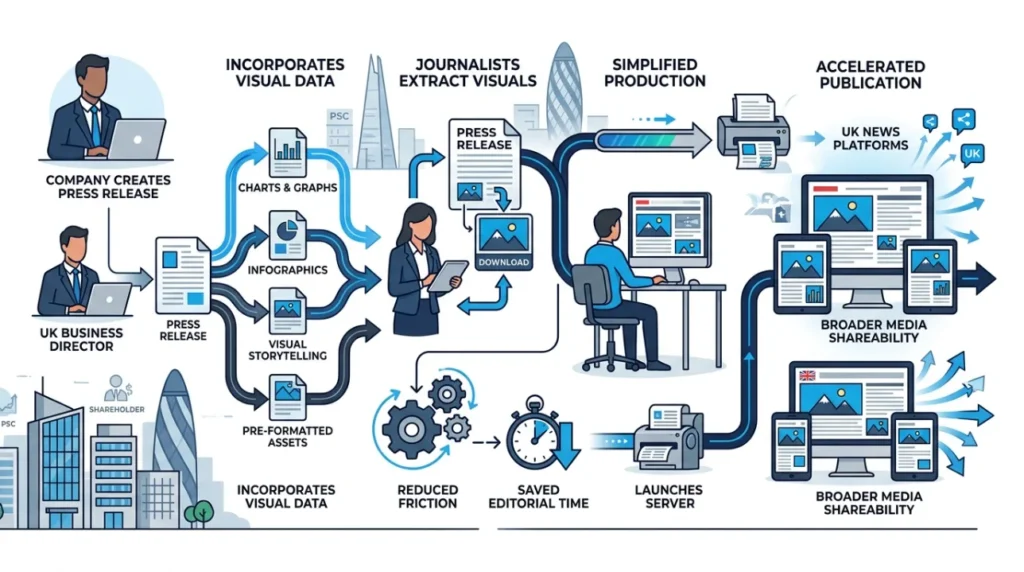
UK editorial newsrooms operate under strict publication deadlines and reduced staff capacity. Journalists process hundreds of research reports weekly. Reports that provide clear, downloadable visual charts reduce the workload for media editors.
Modern Editorial Workflows
When an organisation distributes a report containing embeddable charts, journalists can incorporate those assets directly into their articles without rebuilding graphics from scratch.
- Direct Asset Download: High-resolution graphics formatted in standard aspect ratios allow instant insertion into news sites.
- Embeddable Interactive Charts: HTML-based chart embeds allow publications to host interactive tools directly on their news sites.
- Verifiable Sources: Clear visual callouts that cite data sources explicitly increase trust and likelihood of distribution.
Using data visualisation reports simplifies distribution by ensuring key statistics remain intact and visually striking across syndication networks.
Explore More Expert Insights:
How Fintech Companies Acquire Users Using Banner Ads
How Finance Brands Promote Credit Cards Using Display Campaigns
What are the essential components of a shareable visual report?
A shareable visual report requires precise data accuracy, responsive design, brand consistency, clear labelling, and concise storytelling. These components ensure the underlying information remains accurate, legible, and compelling across various screen sizes, social platforms, and digital publication media.
Creating a shareable visual report requires balancing accurate data representation with clear graphic design principles. Omitting critical components like labels or source citations reduces trust and limits distribution.
Core Graphic Elements
- Clear Typographic Hierarchy: Titles must state the key insight directly rather than using generic labels. For example, use “UK Renewable Energy Output Rose 14% in 2025” instead of “Energy Statistics.”
- Accurate Scale and Baselines: Bar charts must start at a zero baseline to prevent misleading visual distortions.
- Responsive Layout Scaling: Visual elements must adapt dynamically to mobile screens, tablet displays, and desktop monitors.
- Source Citations: Every visual asset must display the source organization, survey sample size, and date range in a footer label.
Integrating these elements consistently ensures that assets shared across platforms retain context and credibility.
How do UK organisations structure data visualisations for maximum reach?
UK organisations structure visualisations for maximum reach by creating modular content blocks, adopting mobile-first visual design formats, applying accessible color palettes, and optimizing visual file sizes for fast web page load speeds across all target devices.
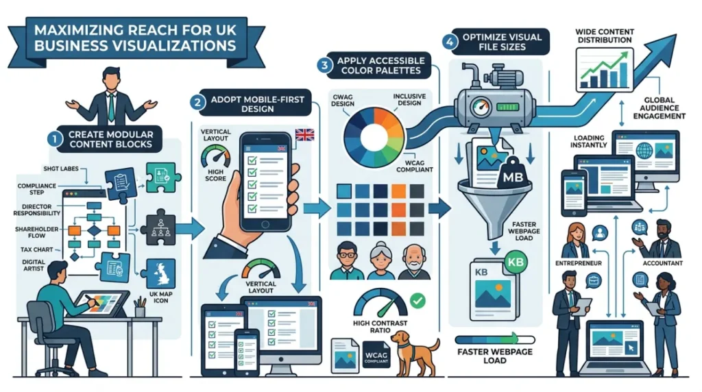
To maximize reach across regional and national channels, published documents should follow a modular architecture. Instead of releasing a single, static 50-page PDF file, organisations divide reports into individual, standalone visual assets.
Strategic Asset Modularisation
Modular design allows different teams to share specific snippets across distinct channels simultaneously.
- Social Cards: Square (1:1) or vertical (9:16) image crops designed specifically for professional networks and microblogging platforms.
- Executive Summary One-Pagers: Single-page visual summaries summarizing top-line metrics for executive decision-makers.
- Embedded Web Graphics: Optimized SVG or WebP vector formats embedded directly into digital newsroom posts.
Optimising visual content for multi-channel publishing improves reach. Organizations aiming to improve distribution often focus on media pickup strategies alongside content creation.
What are the primary use cases for data visualisation in UK sector reports?
Primary use cases include public sector policy reporting, financial market updates, ESG sustainability documentation, healthcare trend tracking, and regional economic analysis. Visualisations translate specialized sector metrics into accessible formats for diverse stakeholder audiences.
Sector-Specific Applications
Different industries rely on distinct graphical formats to communicate key performance indicators clearly:
- Public Sector and Government: Visualising census statistics, local council budget allocations, and public infrastructure spending timelines using geographic heatmaps and stacked area graphs.
- Financial Services: Demonstrating market volatility trends, quarterly asset allocations, and macroeconomic performance metrics using line charts and candlestick charts.
- ESG and Environmental Sector: Tracking carbon emission reductions, supply chain sustainability scores, and renewable energy adoption milestones using progress dials and sankey diagrams.
- Healthcare and Life Sciences: Mapping epidemiological distribution datasets, clinical trial efficacy outcomes, and patient demographic breakdowns using scatter plots and bar graphs.
When organisations apply the correct visual format to sector-specific datasets, technical statistics become readable, shareable, and actionable for broad public audiences.