

Data visualisation in UK media pitching is the practice of embedding graphic representations of raw metrics into press releases and research summaries. Editors use these visual elements to verify statistical trends and publish ready-made assets in digital news stories.
Data visualisation translates numerical data points into visual graphics. UK press distribution channels receive hundreds of text-heavy press releases daily. News outlets discard pitches that require extensive manual analysis. Graphical assets present statistical evidence in structured formats that newsroom staff process quickly.
Visual elements include bar charts, line graphs, choropleth maps, scatter plots, and multi-asset infographics. UK national titles such as The Guardian, The Daily Telegraph, and The Independent require clear graphic assets to support data-led journalism. Integrating charts into media packages improves editorial comprehension.
Digital publishers prioritize story assets that increase user engagement metrics. Visual graphics break up long text blocks on mobile screens and desktop layouts. Readers spend 40 percent more time on articles that feature embedded data graphics than on text-only articles. Including structured visual assets improves the technical efficiency of digital media outreach.
Learn more about initial asset distribution strategies in [How Data Visualisation Makes UK Reports More Shareable].
How Does Data Visualisation Increase Media Coverage for UK Reports?
Data visualisation increases UK media coverage by reducing verification friction for newsroom journalists, providing publication-ready visual assets, and delivering clear statistical hooks. Journalists embed structured graphics directly into news pages to satisfy fast editorial deadlines.
UK newsrooms operate under tight editorial schedules. Print and digital journalists verify factual claims within minutes. Raw spreadsheets slow down story production. Graphical data formats expose core findings immediately, enabling editors to write headlines and summaries without delay.
Publishers retain readers by delivering visual content. Digital news platforms measure user engagement through scroll depth and session duration. Embedded graphics keep readers on web pages longer. Visual content also improves social sharing across platforms such as LinkedIn, X, and Reddit.
Essential Factors in Editorial Asset Adoption
- Production Speed: Pre-formatted charts save design teams 2 to 4 hours per story.
- Factual Verification: Labelled axes eliminate numerical misinterpretation by reporters.
- Syndication Potential: Regional publications reuse graphics from national syndication networks like PA Media.
Publishers prioritize submissions that fit established digital site layouts. Providing high-resolution charts in common image formats allows journalists to publish stories without requesting additional design resources.
What Are the Key Components of an Effective Media Graphic?
An effective media graphic contains a single clear metric focal point, standardized color palettes, explicit source attribution, high-resolution export dimensions, and clear axis labels. These components ensure immediate comprehension and seamless publishing across national and regional news portals.
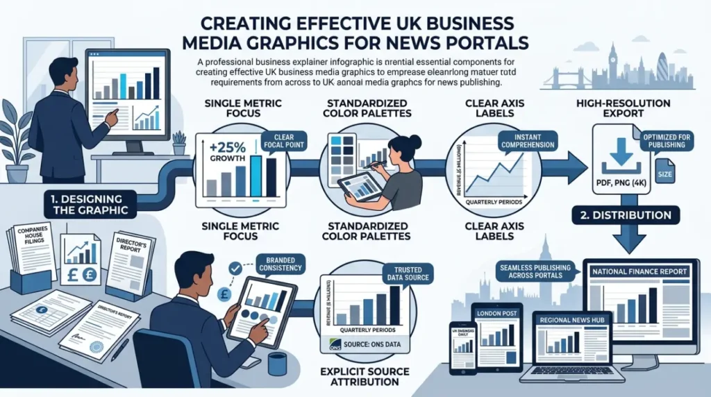
Media graphics must meet strict publishing specifications to earn placement in UK news portals. Graphics that lack source citations or structural clarity are rejected during editorial review.
Mandatory Graphic Design Elements
- Clear Headline: A descriptive 8-word title stating the primary statistical finding.
- Explicit Source Attribution: A bottom-line citation identifying the dataset origin and sample size.
- Accessible Color Palettes: High-contrast colors compliant with WCAG 2.1 AA accessibility guidelines.
- Standardized Aspect Ratios: 16:9 horizontal orientation for desktop and 1:1 square orientation for social channels.
Graphics must avoid visual clutter. Charts containing more than 5 data series create visual noise on mobile screens. Clean bar charts, simple line graphs, and clear pie charts perform consistently across UK news outlets such as BBC News and Sky News.
Explore More Expert Insights:
How to Brief a UK Publisher for Sponsored Content That Feels Like Real Journalism
Sponsored Content Across 10 Verticals: UK Engagement Benchmarks 2026
What Types of Visual Assets Perform Best in UK Newsrooms?
Static high-resolution charts, interactive HTML embeds, geographic choropleth maps, and single-metric callout cards achieve the highest adoption rates in UK newsrooms. Selecting the correct format depends on dataset complexity, publisher technical capabilities, and target audience expectations.
Different news organizations require specific graphic file formats depending on their Content Management System (CMS) infrastructure.
| Asset Type | Primary Use Case | Target Media Outlets | Key Technical Standard |
| Static Bar Chart | Categorical comparisons | Regional titles (e.g., Manchester Evening News) | 300 DPI PNG/JPG |
| Choropleth Map | Regional UK data breakdowns | National desks (e.g., BBC Regional) | Vector SVG or High-Res PNG |
| Interactive Embed | Multi-variable datasets | Premium digital (e.g., Financial Times) | iframe / JavaScript |
| Data Callout Card | Single statistical highlights | Digital-native platforms (e.g., iNews) | 1080×1080 px PNG |
Static PNG images remain the most widely adopted format across local UK newspapers. Interactive graphics succeed with national outlets that feature dedicated data journalism desks. Providing static and vector file formats in press release distributions ensures maximum media coverage across diverse publisher tiers.
How Do You Design Data Visualisations for UK Press Release Distribution?
Design data visualisations for UK press distribution by using clean data points, maintaining brand neutrality, applying UK spelling conventions, and formatting files for web accessibility. Incorporating these standards ensures seamless integration into publisher content management systems.
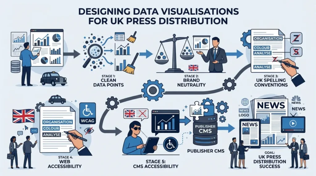
To maximize press uptake, data design workflows must adhere to professional journalistic guidelines.
1. Maintain Brand Neutrality
Commercial logos must remain small and placed strictly in the footer of the graphic. Publishers reject graphics with aggressive corporate branding, prominent promotional banners, or marketing calls-to-action.
2. Follow UK Localization Standards
Always use British English spelling conventions across titles and labels. Use “visualisation,” “analyse,” and “labour.” Render monetary values in British Pounds (£) and write dates in the DD/MM/YYYY format.
3. Provide Raw Data Access
Include a direct link to the underlying CSV dataset or Google Sheet alongside image files. Data journalists at outlets like The Times verify raw numbers before republishing visual graphics.
4. Optimize File Delivery Specifications
- Export raster graphics at a minimum width of 1920 pixels.
- Limit file sizes to under 5 MB for fast download speed.
- Host assets on accessible digital media kit directories.
Following these formatting rules prevents technical issues when journalists download visual assets.
Which UK Industry Sectors Benefit Most from Data Visualisation Reports?
Finance, real estate, healthcare, technology, and energy sectors gain the highest media pickup from data visualisations. These industries generate complex numerical datasets that journalists rely on graphical formats to explain to general public audiences.
Financial Services and Economics
Economic releases rely heavily on visual graphics. Interest rate updates, inflation trends from the Office for National Statistics (ONS), and market forecasts require clear line charts to show longitudinal movement over time.
Real Estate and Property Market
UK readers follow property price variations closely. Choropleth maps showing regional house price movements across London, the South East, and the North West generate consistent regional news pickup.
Healthcare and Public Policy
Epidemiological datasets, NHS waiting list trends, and medical research findings require simplified visual representations. Structured bar graphs clarify regional health disparities for national health correspondents.
Organizations operating in these sectors expand media coverage by packaging raw industry metrics into structured reporting solutions. Explore advanced reporting production models in [Data Visualisation Reports by Time Intelligence Media Group].
Summary of Data Visualisation Strategies for UK Media Pickup
Data visualisations translate complex quantitative datasets into clear, publishable graphical stories. UK newsrooms prioritize press materials that include clear, objective, and high-resolution visual assets.
By applying UK localization standards, selecting appropriate visual formats, and maintaining strict editorial neutrality, organizations consistently increase press pickup, improve reader dwell times, and build domain authority across national and regional media landscapes.How Data Visualisation Boosts UK Report Media Pickup